
heygen-com/hyperframesFrameworks & SDKs
Write HTML. Render video. Built for agents.
49k
Dile Components is a catalog of custom elements you can install by package and use in your app. It groups common UI pieces, editor and viewer components, CRUD building blocks, and icon tools into separate packages, with docs and demos for each.
Builders who want reusable web component packages for their app interfaces.
You can add ready-made UI, editor, viewer, and CRUD components instead of building those pieces from scratch.
`@dile/ui` provides common interface elements like buttons, dialogs, form controls, and toast messages.
`@dile/editor` provides a Markdown WYSIWYG editor for the web.
`@dile/pdf-viewer` adds PDF viewing with zoom and navigation controls.
`@dile/crud` provides customizable generic CRUD components.
`@dile/icons`, `@dile/iconlib`, and `@dile/utils` cover SVG icons, icon libraries, and helper components.
`docs/` and `demos/` show the components, their usage, and the catalog site.
npm install @dile/ui
This is the repository for Dile Components, a catalog of Custom Elements built with Web Components and Lit.
Find the full documentation and details of the Dile Components catalog at dile-components.com
If you're looking for the previous version of this component catalog, you can find it in this repository: https://github.com/Polydile/Components-legacy
@dile/ui: Components for building common user interfaces, such as buttons, dialogs, custom form elements, and more.@dile/utils: Utility components that provide helpful functionalities for web development.@dile/icons: Templates for integrating SVG icons into your components.@dile/editor: A Markdown WYSIWYG (What You See Is What You Get) editor for the web.@dile/pdf-viewer: Web component for PDF viewing with zoom and navigation controls.@dile/crud: Customizable and generic CRUD components.@dile/lib: A library featuring components and classes designed to simplify frontend application development.@dile/iconlib: Icon libraries web components implementations.To use components from this library, follow the steps below.
First, install the package that contains the component you want to use. For example, to use the UI custom elements, install @dile/ui:
npm install @dile/ui
To use a component from this library, import the specific element you need. For example, to use the toast feedback element:
import '@dile/ui/components/toast/toast.js';
Then, you can use the component in your application like this:
<dile-toast></dile-toast>
You can find a complete list of custom elements—along with their properties, methods, events, and usage examples—on the Dile Components website:
If you'd like to contribute by publishing a component to this library, you can find a complete guide to understanding the component organization.
Sign in to join the discussion.
No comments yet. Be the first to say what this is good for.
Write HTML. Render video. Built for agents.
Ultra-lightweight, open-source, self-hosted personal AI agent framework in Python with WebUI, tools, memory, MCP, multi-agent workflows, automation, and chat apps

SkillOpt is a text-space optimizer that trains reusable natural-language skills for frozen LLM agents through trajectory-driven edits, validation-gated updates, and deployable best_skill.md artifacts.
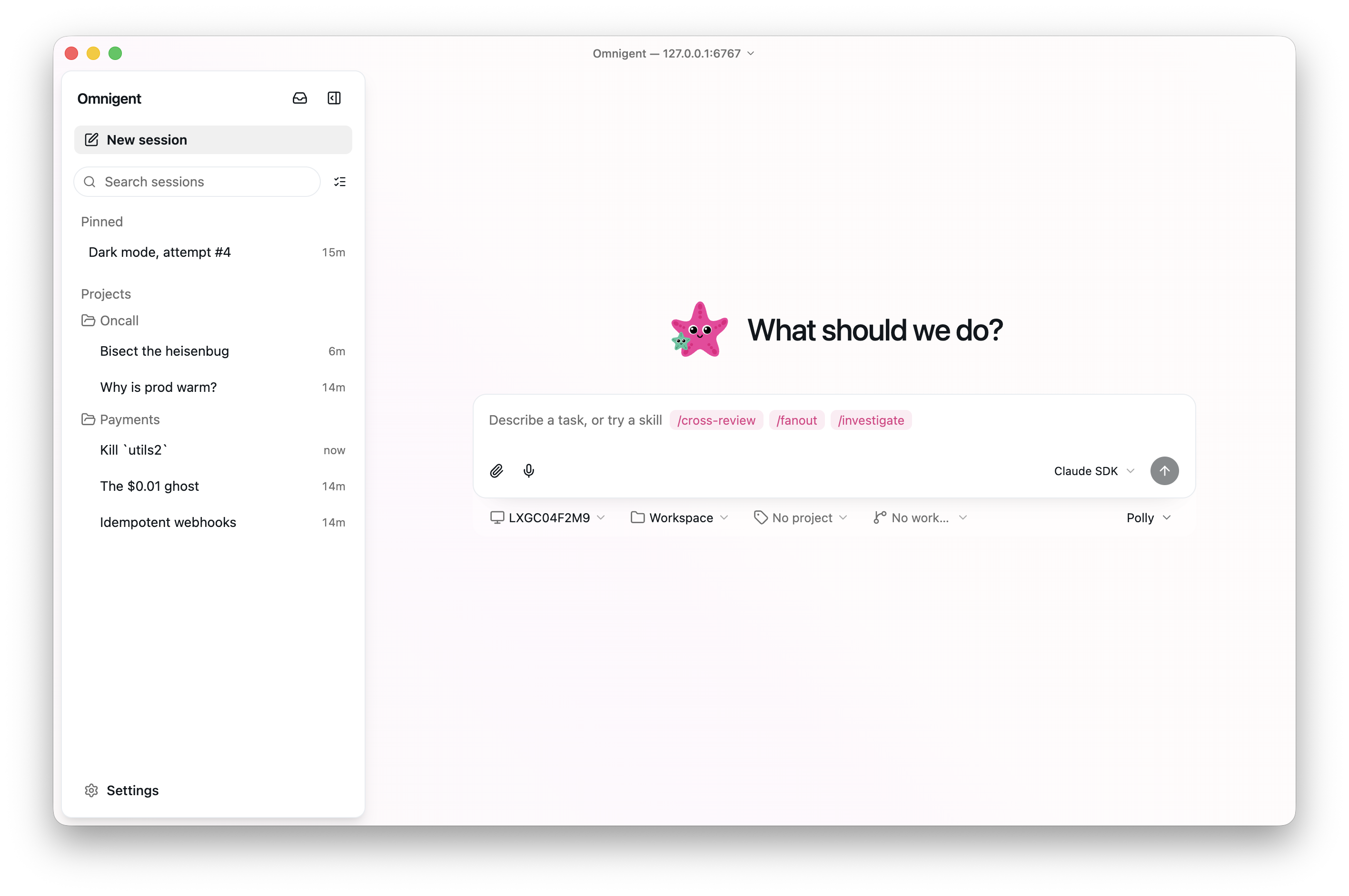
Omnigent is an open-source AI agent framework and meta-harness: orchestrate Claude Code, Codex, Cursor, Pi, and custom agents — swap harnesses without rewriting, enforce policies and sandboxing, and collaborate in real time from any device.

A theoretical reconstruction of the Claude Mythos architecture, built from first principles using the available research literature.
🕷️ An adaptive Web Scraping framework that handles everything from a single request to a full-scale crawl!