
obra/
superpowers

obra/superpowersSkills
An agentic skills framework & software development methodology that works.
285k
1 add
This skill tells Claude Code how to style charts and graphs using Tufte's principles: remove chartjunk, label directly, use restrained color, and keep the data front and center. It also adds screen-first guidance for accessibility, responsiveness, animation, and dark mode across multiple charting libraries.
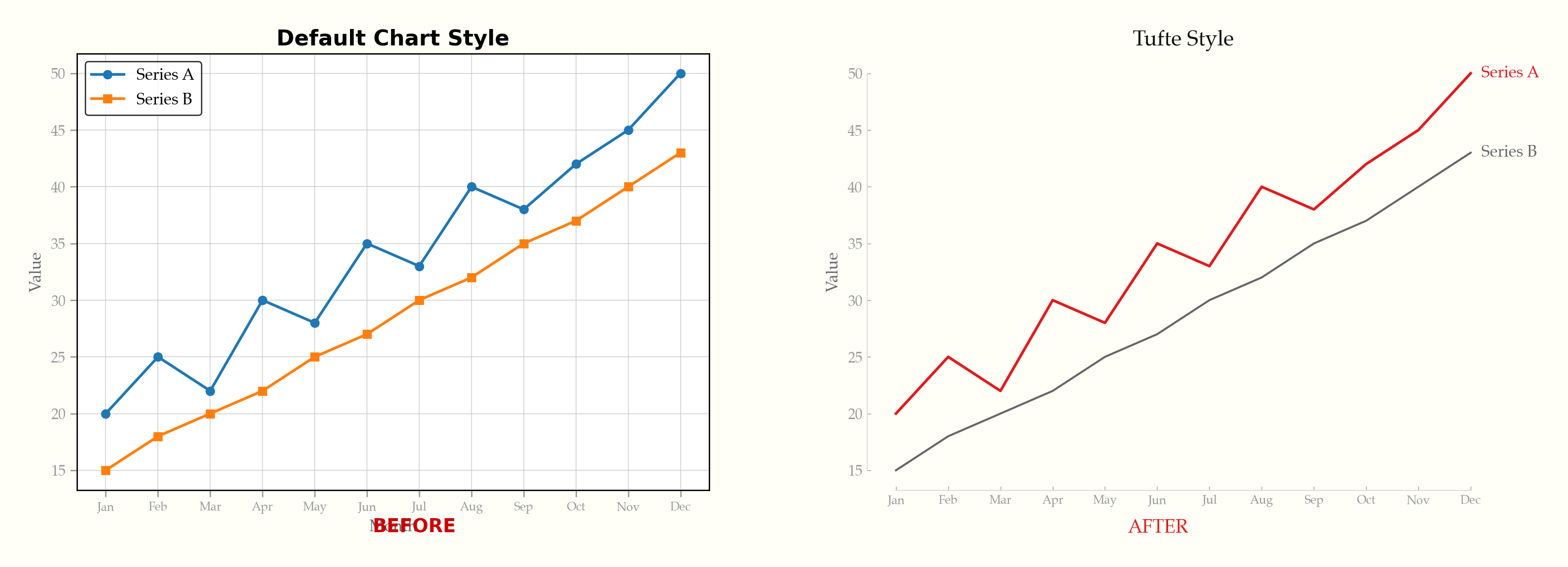
Builders who use Claude Code to generate charts and want a reusable visual style guide.
You can turn default charts into clearer, more honest visuals without re-explaining your style preferences each time.
Applies 22 rules for data-ink ratio, direct labels, range-frame axes, serif typography, and minimal decoration.
Adds progressive disclosure, accessibility checks, responsive behavior, purposeful animation, and intentional dark mode.
Includes separate rule files for Recharts, ECharts, Chart.js, matplotlib, Plotly, and D3/SVG.
Shows before-and-after images, a live demo, and example code for several charting libraries.
Lists common chart mistakes and one-line fixes in `rules/anti-patterns.md`.
npx skills add caylent/tufte-data-viz
An agent skill that applies Edward Tufte's data visualization principles when generating charts, plots, and graphs. Produces clean, honest, high-data-ink-ratio visualizations across multiple charting libraries — extended with modern screen-first standards for accessibility, responsiveness, and interactivity.
This skill is opinionated by design. It will remove your gridlines, delete your legends, reject your pie charts, and insist on serif fonts. It enforces a specific visual philosophy — Tufte's — not a neutral one. If you want total creative freedom over your chart styling, this is not the skill for you. If you want every chart to come out clean, honest, and readable without thinking about it, read on.
npx skills add caylent/tufte-data-viz
The same data, default styling vs. Tufte principles applied:
See it happen live — gridlines fade, legends become direct labels, chartjunk dissolves:
Try the live demo — toggle between default and Tufte styling across ECharts, Chart.js, Plotly, and D3.js. Includes dark mode.
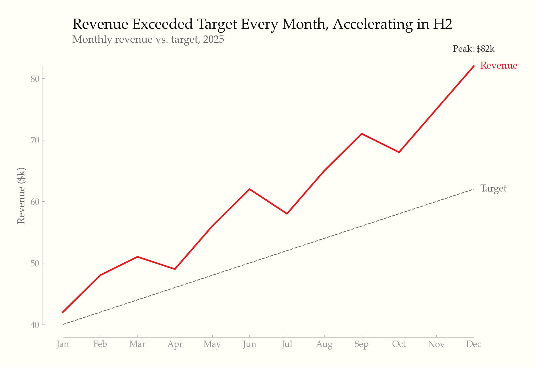
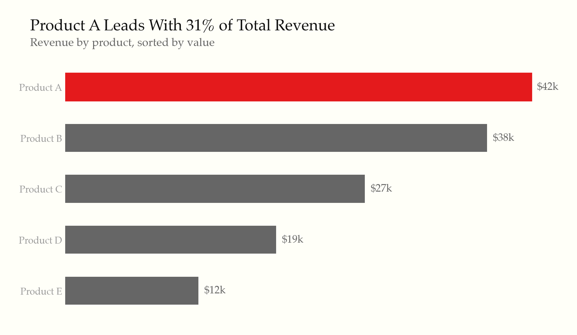
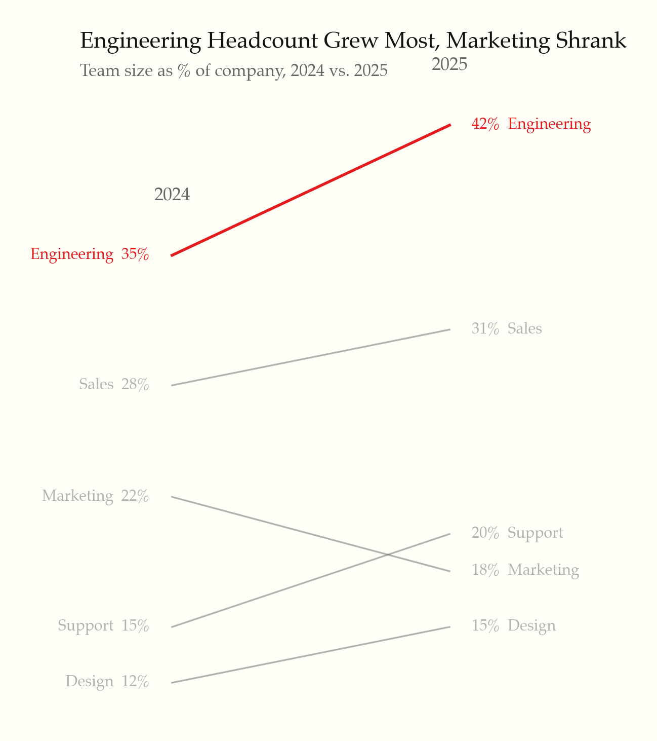
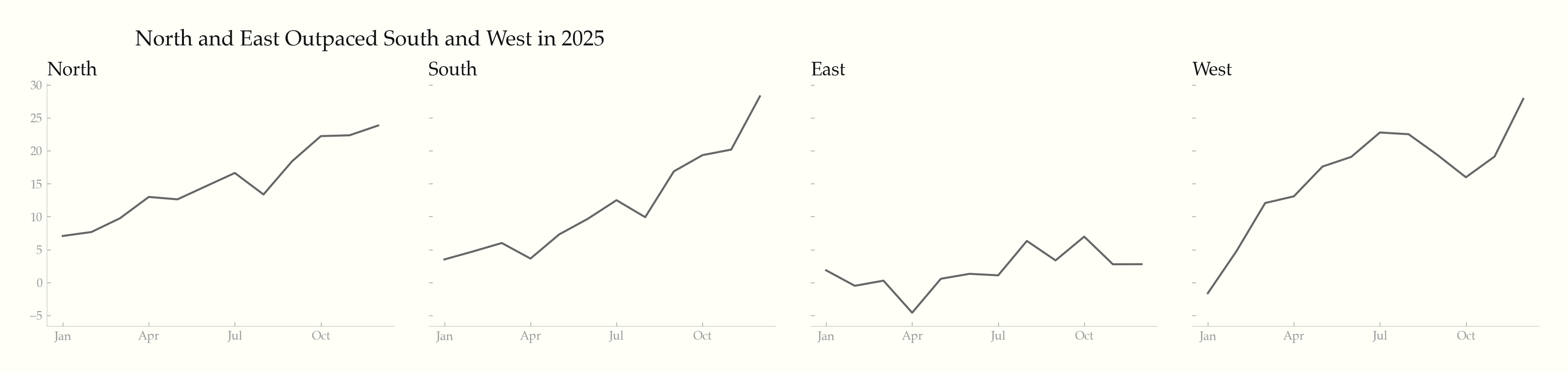
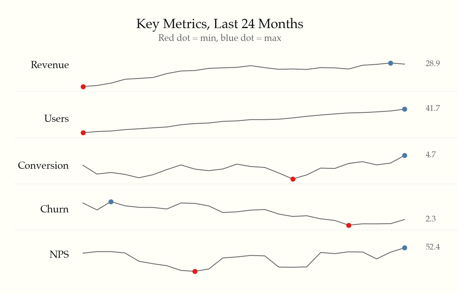
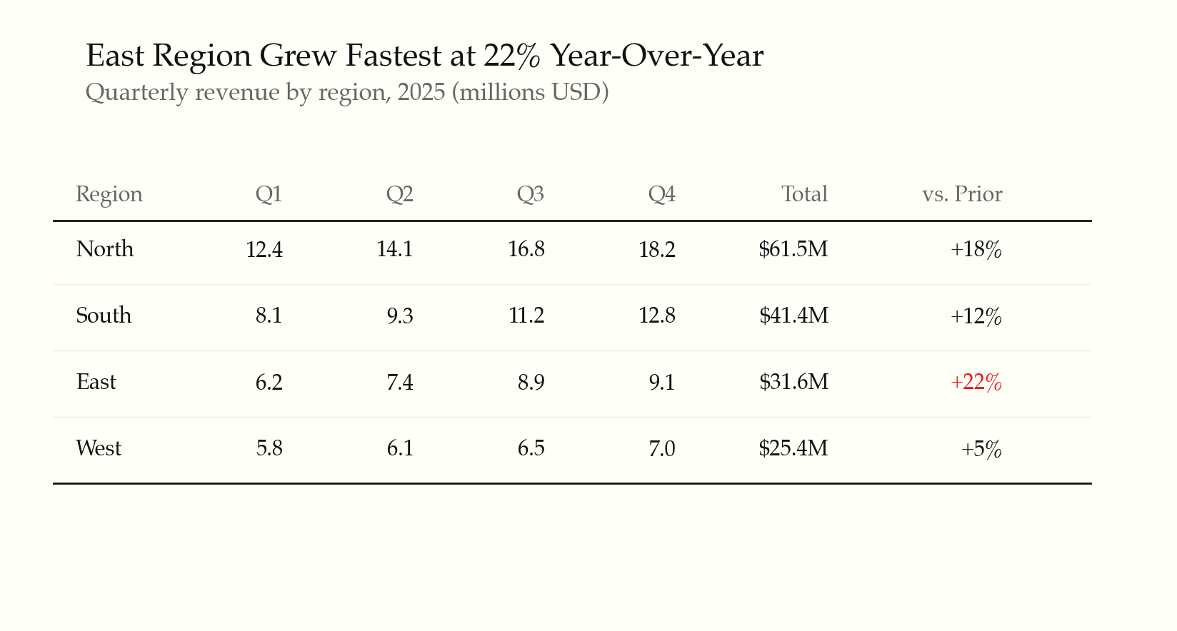
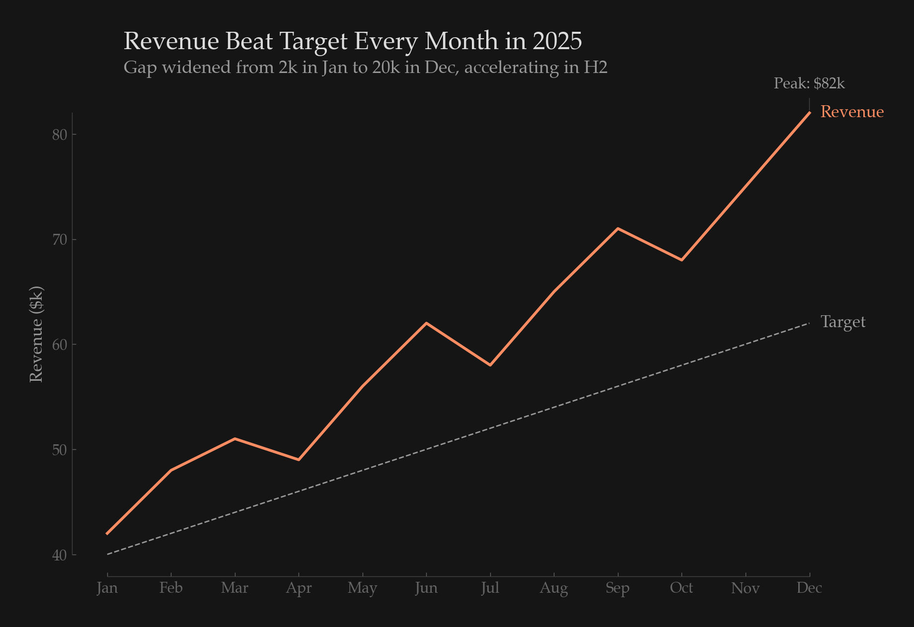
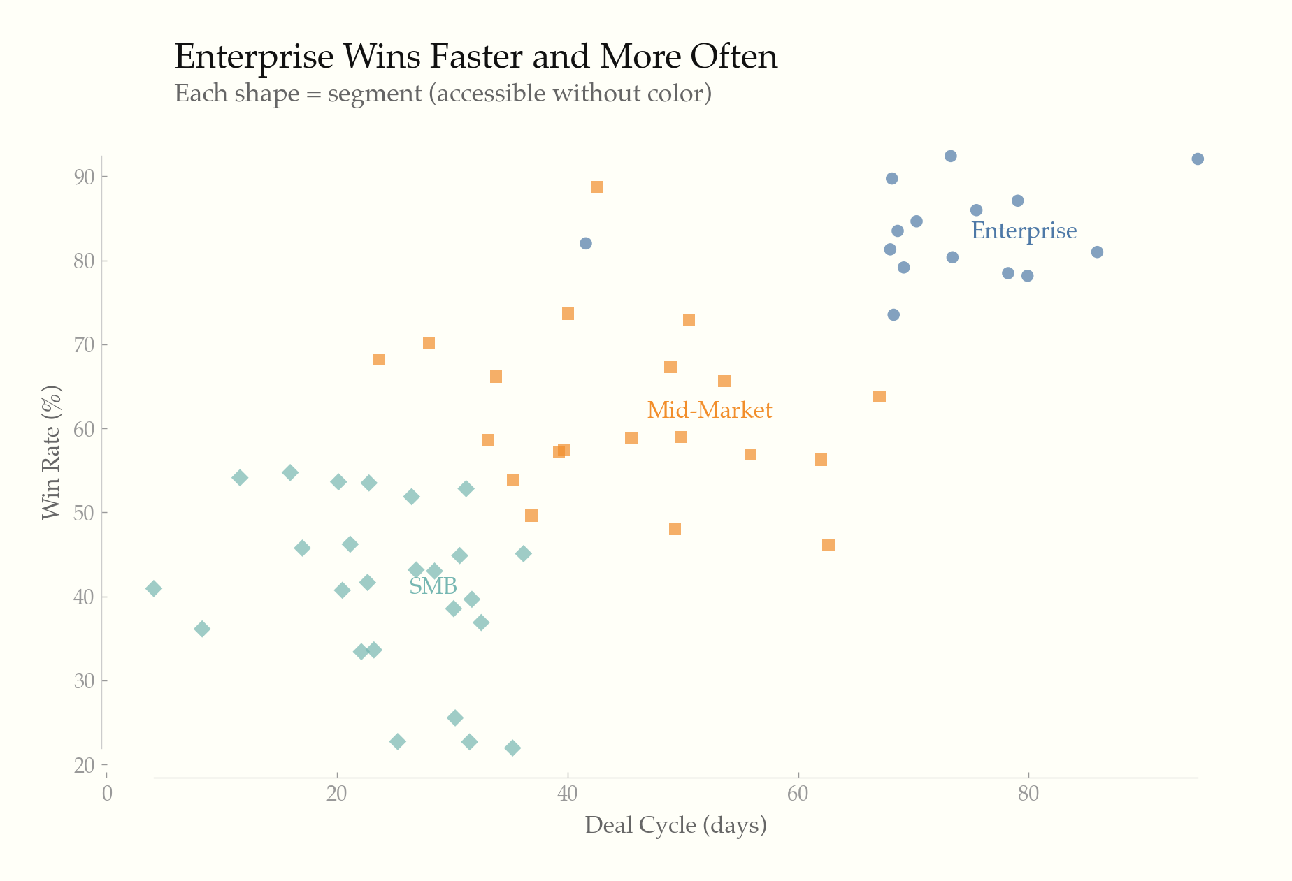
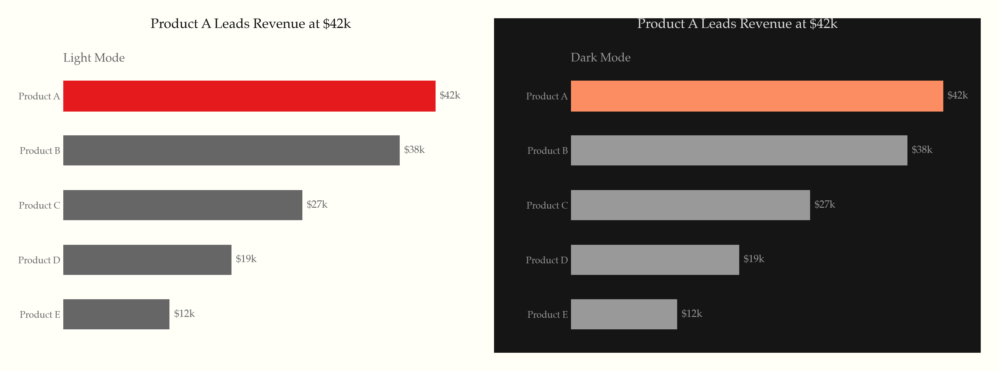
22 universal rules applied to every chart, organized in three tiers:
Static principles (rules 1–14) — the Tufte foundation:
Screen-first principles (rules 15–19) — modern interactive contexts:
prefers-reduced-motion)Content & formatting (rules 20–22) — what Tufte assumed but never codified:
| Library | Rule file | Language |
|---|---|---|
| Recharts | rules/recharts.md | React/JSX |
| ECharts | rules/echarts.md | JavaScript |
| Chart.js | rules/chartjs.md | JavaScript |
| matplotlib | rules/matplotlib.md | Python |
| Plotly | rules/plotly.md | Python/JS |
| D3.js / SVG / HTML | rules/svg-html.md | Web |
rules/interactive-and-accessible.md — progressive disclosure, accessibility, responsive, animation, dark moderules/typography-and-color.md — font stacks, palettes, hex valuesrules/anti-patterns.md — common violations and one-liner fixesrules/small-multiples-sparklines.md — small multiples, sparklines, slopegraphsMIT
Sign in to join the discussion.
No comments yet. Be the first to say what this is good for.
An agentic skills framework & software development methodology that works.

Turn any codebase, with its docs, SQL schemas, configs, and PDFs, into a queryable knowledge graph. A /graphify skill for Claude Code, Cursor, Codex, and Gemini CLI: local deterministic AST parsing, every edge explained, no vector store.

Topic in, narrated explainer video out. A Claude Code / Codex skill that turns any topic into a black-canvas motion-graphics explainer video with TTS voiceover, subtitles and a chapter progress bar. Chinese or English; every frame drawn in code with Remotion.
Public repository for Agent Skills
Open-source AI job search: scan job portals, evaluate listings into a structured A-H report with a global 1-5 score, tailor your CV, track applications — runs locally in your AI coding CLI (Claude Code, Codex, OpenCode, Antigravity…)
Production-grade engineering skills for AI coding agents.