
JuliusBrussee/
caveman

🪨 why use many token when few token do trick — Claude Code skill that cuts 65% of tokens by talking like caveman
105k
1 add
AgnosticUI Local copies UI components into your project so the source lives beside your app code. The CLI supports React, Vue, Svelte, and Lit, and the components are built as local files with CSS tokens, tests, and framework wrappers. It also ships playbooks and prompt docs for AI-guided UI generation, so builders can scaffold consistent flows with components the agent can actually see. The result is a framework-agnostic component system that works well with local context and editable source.
Builders who want their agent to work from local UI source instead of a hidden package.
You can add and edit accessible UI components in your repo, with your agent working from the same source you do.
`agnosticui-cli add` places component source directly under your repo, with files like `Button.vue`, `Button.css`, and `Button.test.ts`.
The CLI can initialize and add components for React, Vue, Svelte, and Lit/Web Components.
The docs include playbooks for Login, Onboarding, Dashboard, Support Center, Data Grid, Blog Reader, and Landing pages.
Components expose visual tokens through CSS variables so you can swap skins by importing token files.
The library uses semantic HTML, WAI-ARIA patterns, keyboard navigation, contrast checks, reduced motion, and focus management.
Because components live in your repo, tools like Cursor, Claude, Copilot, and Windsurf can read the exact code instead of guessing from a package.
cd my-react-app
npx agnosticui-cli init --framework react
npx agnosticui-cli add Button Card Input
cd my-vue-app
npx agnosticui-cli init --framework vue
npx agnosticui-cli add Button Card Input
cd my-svelte-app
npx agnosticui-cli init --framework svelte
npx agnosticui-cli add Button Card Input
cd my-lit-app
npx agnosticui-cli init --framework lit
npx agnosticui-cli add Button Card Input


Copy the source · Own the code · Framework-agnostic · Built for humans and AI agents
One component library. Every framework.
Documentation · Login AI Playbook · Onboarding AI Playbook · Dashboard AI Playbook · Components · Quick Start
AgnosticUI components are copied into your project at install time.
They live in your repo (not hidden inside node_modules):
cd your-project
npx agnosticui-cli init --framework vue  # or react, lit, svelte
npx agnosticui-cli add Button Card Input
The component source lands directly in your project. Readable, editable, and yours.
src/
components/
ag/
Button/
Button.vue ← your file now
Button.css ← your tokens now
Button.test.ts ← your tests now
Components land under src/components/ag/ by default: a dedicated namespace that keeps AgnosticUI components separate from your own. Configurable if you prefer otherwise.
Because the code is local, it solves the "Black Box" problem of traditional libraries hidden in node_modules.
Cursor · Claude · Copilot · Windsurf · Aider · Gemini · Replit · Kiro · Antigravity
Every tool sees the raw source. This creates a high-fidelity environment for Generative UI and Agent-driven interfaces:
This is the architecture for the next era of development: context-aware, framework-agnostic, and AI-ready.
The schema-driven layer ships with three companion documents:
v2/docs/sdui-architecture.md — full system architecture: codegen pipeline, node graph model, renderers, CI gates, and key design decisionsv2/docs/llm-prompt-guide.md — copy-paste system prompt template and few-shot examples for generating valid AgNode[] graphsv2/docs/schema-coverage.md — per-component SDUI coverage registry, renderer parity status, and omission reasonsAgnosticUI's components are authored as Lit Web Components, a standards-based layer over native Custom Elements. The CLI wraps them for your framework at copy time.

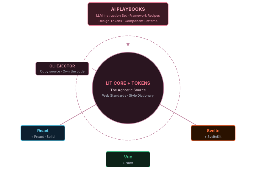
Your design system doesn't fork when your tech stack does. Supports agent-generated UI workflows directly from Playbooks.
...
| AgnosticUI | Typical component library | |
|---|---|---|
| Source in your repo | ✅ | ❌ |
| Framework agnostic core | ✅ | ❌ |
| LLM-readable locally | ✅ | ❌ |
| AI & agent-driven Playbooks included | ✅ | ❌ |
| Multiple theme skins | ✅ | Limited |
| Zero runtime dependency | ✅ after ejection | ❌ |
Playbooks (Login Form, Onboarding Wizard, Discovery Dashboard, Support Center, Data Grid, Blog / Article Reader, Landing / Marketing Page) demonstrate modular, prompt-driven UI components. Each Playbook can be used in agent systems, for context-aware applications, or to create generative UI patterns.
| Playbook | What it builds |
|---|---|
| Login Form | Responsive login: mobile, floating card, two-column desktop; works with AI prompt-driven generation |
| Onboarding Wizard | Multi-step flow with progress, validation, and skip logic; supports agent-assisted workflows |
| Discovery Dashboard | Dashboard shell with header, sidebar, and data regions — ideal for agent-generated interfaces |
| Support Center | Help center with search, categories, and article layout; integrates with prompt-driven workflows |
| Data Grid | Responsive, interactive data grid with sorting, filtering, and multiple view modes; compatible with agent-driven and context-aware interfaces |
| Blog / Article Reader | Typography-first editorial layout with scroll-aware components and in-article search highlighting; theme switcher, dark/light mode, React/Vue/Lit demos |
| Landing / Marketing Page | Polished product marketing page with hero, features, testimonials, pricing, and FAQ; animated components, theme switcher, dark/light mode, React/Vue/Lit demos |
Each Playbook on the docs site includes live StackBlitz examples for React, Vue, and Lit, and ships with:
PROMPT-3-FRAMEWORKS.md: one prompt to generate the pattern across all three frameworksFully prompt-ready for agent-driven UI generation. Drop a Playbook prompt into Cursor, Claude Code, or Copilot and watch it assemble Input, Button, Card, and FormGroup correctly on the first try — because it has the full recipe, not just a component reference.
The prompts are yours to adapt. Feed one to your LLM as a crash course in AgnosticUI's patterns, fork it for your own stack, or use it as a blueprint for writing Playbooks around your own UI patterns.
AgnosticUI components expose their entire visual surface through CSS custom properties. Swap a skin and every component updates; no code changes, no find-and-replace.
/* Base tokens are required, then layer your skin on top */
@import "./components/ag/styles/ag-tokens.css";
@import "./components/ag/styles/ag-tokens-dark.css";
@import "./components/ag/styles/brutalist-light.css";
@import "./components/ag/styles/brutalist-dark.css";
Hand it to a designer. Get back a token file. Import it. Done.
React
cd my-react-app
npx agnosticui-cli init --framework react
npx agnosticui-cli add Button Card Input
Vue
cd my-vue-app
npx agnosticui-cli init --framework vue
npx agnosticui-cli add Button Card Input
Svelte
cd my-svelte-app
npx agnosticui-cli init --framework svelte
npx agnosticui-cli add Button Card Input
Lit / Web Components directly
cd my-lit-app
npx agnosticui-cli init --framework lit
npx agnosticui-cli add Button Card Input
After running add, your terminal prints the exact import path for your project. No guessing. Supports agent-driven and prompt-ready UI workflows.
Accordion · Alerts · AspectRatio · Avatar · Badge · Breadcrumb · Button · Card · Checkbox · Collapsible · Combobox · CopyButton · Dialog · Divider · Drawer · EmptyState
Fieldset · Input · Radio · Rating · Select · SelectionButtonGroup · SelectionCardGroup · Slider · Toggle
Header · Menu · Pagination · Tabs
Loader · Progress · ProgressRing · ScrollProgress · Skeleton Loader · Spinner · Toast
Icon · Icon Button · Image · IntlFormatter · Kbd · Link · Mark · MessageBubble · Popover · ScrollToButton · Table · Tag · Timeline · Tooltip · VisuallyHidden
BadgeFx · ButtonFx · Flex · IconButtonFx
AgnosticUI is open source and welcomes contributions. See CONTRIBUTING.md for component authoring guidelines, the token system, and how to write Playbook entries.
Apache License 2.0 © AgnosticUI
AgnosticUI v2 is a complete rewrite and is not compatible with v1. If you need v1, it remains available via git tags:
agnostic-angular, agnostic-react, agnostic-vue, agnostic-svelte, etc.v1-legacySign in to join the discussion.
No comments yet. Be the first to say what this is good for.
🪨 why use many token when few token do trick — Claude Code skill that cuts 65% of tokens by talking like caveman

The best-benchmarked open-source AI memory system. And it's free.

Orca is the ADE for working with a fleet of parallel agents. Run any coding agent with your own subscription. Available on desktop, mobile and remote runtime.
A cross-platform desktop All-in-One assistant for Claude Code, Codex, OpenCode, OpenClaw, Grok Build & Hermes Agent. Only official website: ccswitch.io

Never stop coding. Free MIT AI gateway: one endpoint, 352 providers (150+ free), 1200+ models Kimi, Claude, GPT, Gemini, GLM, DeepSeek, MiniMax. Works with Claude Code, Codex, Cursor, OpenCode, Cline & Copilot. Quota-aware auto-fallback, RTK+Caveman compression saves 15-95% tokens, MCP/A2A, Desktop/PWA. Built by 550+ contributors

Compress tool outputs, logs, files, and RAG chunks before they reach the LLM. 20% fewer tokens for coding agents, 60-95% fewer tokens for JSON, same answers. Library, proxy, MCP server.